Fonts on Linux, Chapter Two: Improving freetype rendering
I have previously shown how to change default and fallback fonts with a user configuration.
The results are already very good. Nevertheless, I have adjusted the substitutions a little more now, and went through all files in /etc/fonts/conf.dto see what is what and if I can delete some, and uninstall some fonts. A leisurely thing to do in one or two hours...
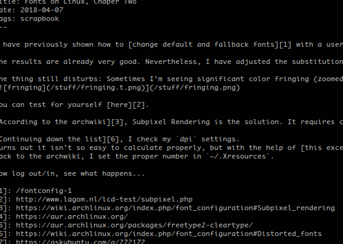
One thing still disturbs: Sometimes I'm seeing significant color fringing (zoomed to 200%):
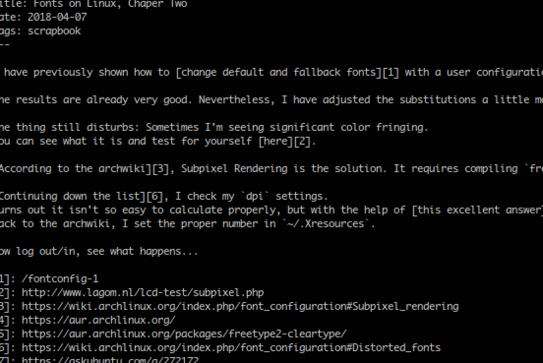
You can test for yourself here.
According to the archwiki, Subpixel Rendering is the solution. It requires compiling freetype2 with Microsoft's patented ClearType option enabled. Once again, the AUR has a package.
Continuing down the list, I check my dpi settings.
Turns out it isn't so easy to calculate properly, but with the help of this excellent answer and my monitor's EDID, I found out that it's not the usual 96, but 99dpi!
Back to the archwiki, I set the proper number in ~/.Xresources:
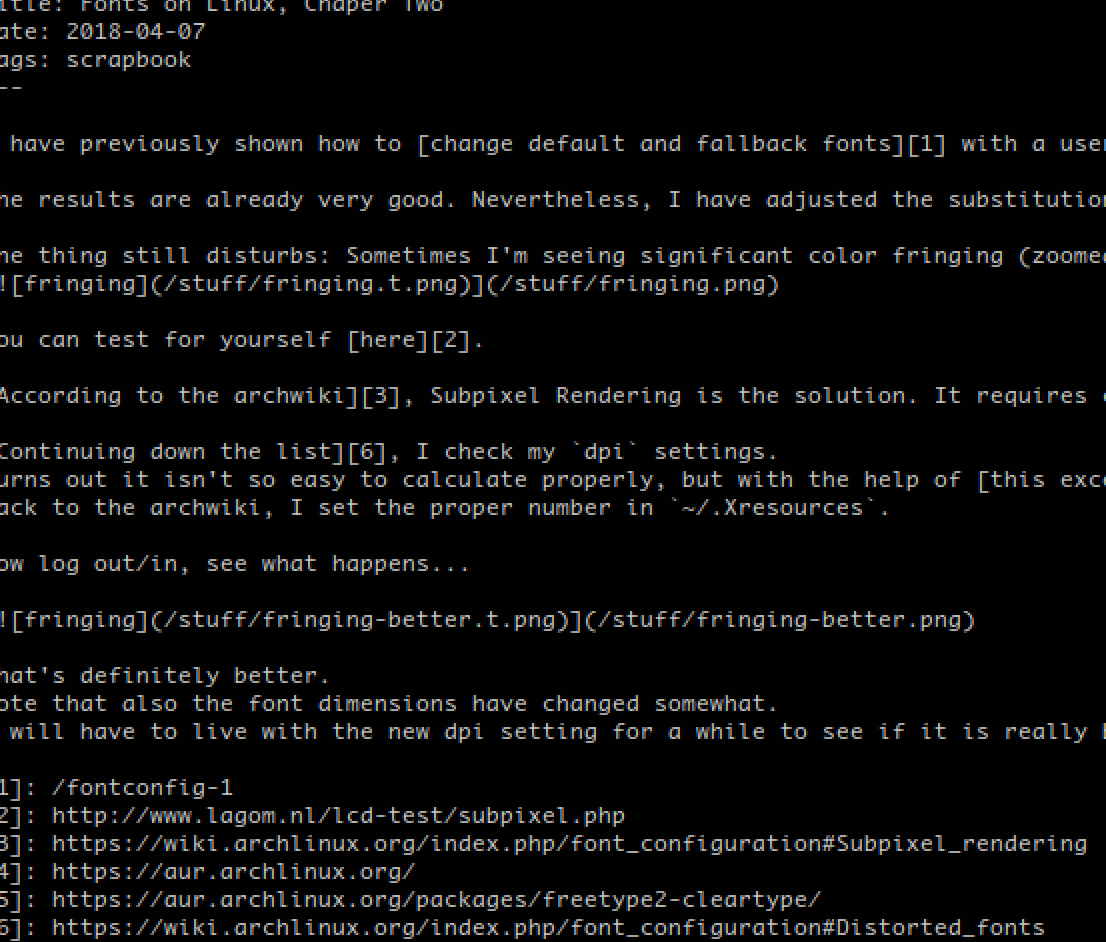
Xft.dpi: 99Now log out/in, see what happens:
That's definitely better.
Note that also the font dimensions have changed somewhat.
I will have to live with the new dpi setting for a while to see if it is really better that way.
Freetype also has a config file in /etc/profile.d/freetype2.sh:
sh# Subpixel hinting mode can be chosen by setting the right TrueType interpreter
# version. The available settings are:
#
#     truetype:interpreter-version=35  # Classic mode (default in 2.6)
#     truetype:interpreter-version=38  # Infinality mode
#     truetype:interpreter-version=40  # Minimal mode (default in 2.7)
#
# There are more properties that can be set, separated by whitespace. Please
# refer to the FreeType documentation for details.

# Uncomment and configure below
#export FREETYPE_PROPERTIES="truetype:interpreter-version=40"
export  FREETYPE_PROPERTIES="truetype:interpreter-version=35 cff:no-stem-darkening=1 autofitter:warping=1"
As you can see I already commented out the defaults and am now testing a different interpreter, together with a few more options I found in this file: /usr/include/freetype2/freetype/config/ftoption.h - I have no idea what these do, but I couldn't find any comprehensible or easily digestible documentation on freetype2 user configuration. So I just try it out and see what changes:
I can't see any difference to the previous result, so I comment that setting out again.
A monospaced font with ligatures?
See for yourself:


(Noto Sans Mono, Nimbus Mono PS)
That doesn't make sense. I can only assume that I messed up somewhere when I was revisiting /etc/fonts/conf.d.
My system's default monospace font is Terminus, but Firefox rejects this font because it is a bitmap font, and chooses Noto Sans Mono instead.
For now I can fix it by editing ~/.config/fontconfig/fonts.conf and tell it to use something else:
xml<alias binding="same">
        <family>monospace</family>
        <accept>
                <family>xos4 Terminus</family>
                <family>Terminus</family>
                <family>Monaco</family>
                <family>Andale Mono</family>
        </accept>
</alias>